
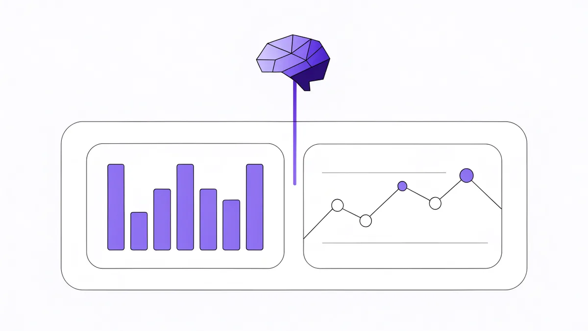
Every team has a dashboard someone built with real care that nobody reads anymore. The charts still update. The numbers are still accurate. And every Monday someone still asks "so how are we actually doing?", because a wall of accurate numbers is not an answer, it is homework. The reader is left to do the one job software was supposed to help with: connecting the numbers into a story and deciding whether the story is fine.
Binee's dashboards are built on the position that this connecting step belongs to the product. Here is how that works in practice.
The Pulse: a written status above the cards
Every Binee dashboard opens with its Pulse, a section pinned above the cards where all of Binee's thinking about the board lives. It carries three things: a status pill for the whole board (Looking steady, Worth a look, or Needs attention), a short written update on what the numbers say about the business, and up to three ranked findings where Binee connected dots across the board's cards and sources. Each finding carries an importance label, High means act now, Medium means look soon, Watch means keep an eye on it, and shows the logos of the tools it drew from.
The findings are the part raw charts cannot do. Say the cards show completed tasks dipping while meetings pile up. Two accurate charts, no story. The Pulse's top finding connects them: the dip lines up with three days of back-to-back client escalation calls. That is the sentence the Monday standup actually needed, and it took a read across a project tool and a calendar that neither tool could have produced alone.
The Pulse reads the cards themselves, so a board of ten delivery cards gets a delivery read and a mixed board gets cross-tool connections. It also learns what this board's readers value: every member, viewers included, can mark a finding useful or not useful, and the next refresh leans toward what the team found useful. Mark the client-risk findings useful and the routine volume notes not useful, and within a few refreshes the Pulse leads with client risk. Editors can dismiss a finding once it is handled, which hides it for everyone. And in keeping with how Binee treats evidence everywhere, when something limits what the Pulse could read, it says what it could not see instead of presenting a gap as a quiet business.
Cards a single tool could not draw
The cards themselves go beyond re-rendering one tool's reports. You add a card by describing it in plain words to Binee Assistant, "a daily chart of how many meetings and emails I get", and things you describe together become one card: that request is a single chart with a line for meetings and a line for emails, read from the tools you actually have connected.
The interesting templates are the cross-tool ones only Binee can draw, like Tasks and meetings per day: your completed tasks and your recorded meetings on one chart, one line each, so you can see whether they move together, the classic "our delivery drops in heavy meeting weeks" suspicion made checkable. Or the Needs your attention card, which puts your latest Binee insights next to your delivery numbers: a slipping ClickUp date connected to a promise made by email shows up right beside the counts it explains. Every card carries the logos of the tools it reads, so you always see where numbers come from, and every card has an ask button that opens Binee Assistant with a matching question ready, like "which of my overdue tasks are most urgent, and is any of them breaking a date we promised a client?".
Honesty is built into the cards too: a number from a capped reading shows as "15+" rather than pretending to be exact, and a card whose sources cannot honestly compute what you asked says so instead of showing made-up numbers.
Shared boards, per-viewer numbers
Sharing is per dashboard: a workspace owner or admin creates a board and invites members as viewers or editors, and only invited people see it. The part that separates this from screenshot-a-report culture is that every viewer's numbers are computed from their own visibility in the connected tool. If a teammate cannot see a private ClickUp space, that space's tasks are not in their version of the dashboard either, so two people can look at the same shared board and correctly see different counts. A viewer who has not connected a tool at all sees an honest note on the card, not a zero pretending to be data.
Cards that read someone's own live sources, a mailbox, a calendar, are computed with that person's connection, and putting such a card on a shared board is an explicit choice to share what it shows. Your "Emails waiting on me" card on the team's delivery board shows everyone the same list, because you put it there.
What it costs, and what happens on a bad day
Opening a dashboard is free, always, and so is every filter, time range, and shape change; browsing never spends anything. A refresh is the one thing that costs credits: it recomputes the created cards and writes the Pulse in the same run, for 0.5 credits, priced like a chat question when the gathering is heavy. Refreshes are lazy, running only when someone opens a board whose numbers are more than six hours old, so a dashboard nobody opens spends nothing.
And when things go wrong, the board says so. If the workspace runs out of credits, created cards stop refreshing and show how old their numbers are. If a refresh fails, the affected cards say so and keep their last computed numbers visible instead of going blank.
The test for any dashboard is whether it answers "how are we doing?" or merely illustrates it. Cards illustrate. The Pulse answers, in writing, with the evidence on the same screen. That is what a brain adds to a dashboard, and why we will not ship one without it.
The Binee newsletter
One email a month: what shipped, what we learned running businesses on an AI brain, and the best new templates. No spam, unsubscribe anytime.